How accurate is your gadget of choice at predicting your individual response to exercise? How close is that V̇O₂max estimate from your sport watch? How close was the predicted race time to your real results? How far apart are your FTP/threshold estimates between a ramp test, a 20 minute test, and a 60 minute time-trial?
How come with millions of people giving away their biometric data to tech companies, it’s still so difficult to predict individual responses?
In a few words, because lots of data improves group-level confidence intervals, but does not improve individual-level prediction intervals.
Let’s simulate some data and I’ll try to explain what those words mean. Then we can look at real-world lactate threshold data and consider what interpretations we can draw from it.
This is a quick re-write of a twitter thread I posted in September, 2023. Since X née Twitter is more difficult to read these days without an account, and even less worth it than ever to create an account.. it might be worth transferring over some of my threads back here to the old blog. We’ll see!
There is uncertainty in every measurement. Uncertainty comes from measurement error and ‘real’ variation in whatever we are trying to observe.
If I stick my finger up into the wind, I will have a large measurement error: my finger isn’t very sensitive to measuring wind speed. The wind might also have lots of variation from any one moment to the next.
If I’m recording my heart rate during exercise, the device I use might have more or less measurement error. Consider a 12-lead EKG measuring electrical activity across the torso and reporting a continuous wave pattern, compared to a chest strap detecting the same signal from only two electrodes and reporting bpm once per second. Then compare that to an optical watch trying to derive HR from changes in light reflectance through skin between pulses. The former has lower measurement error, the latter has larger error.

Then there are all kinds of sources of biological variability that will change my heart rate, one moment to the next, and between different exercise sessions at the same workload. (We tried to quantified this day-to-day variability in HR and other common cycling metrics in a recent paper).
Those are examples of individual-level uncertainty, but this of course scales up to group-level uncertainty. We (should) know that different athletes can have very different heart rates at the same workload, or even at the same relative intensity. 150 bpm will mean very different things to different people. The HR maintained during steady-state exercise might be 140 bpm in one athlete, and 180 bpm in another.
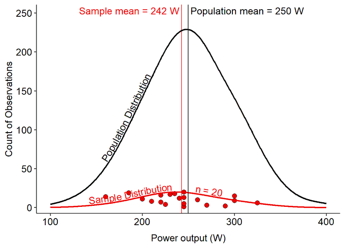
Simulated Example of Power Data
Let’s consider something more obvious: power output or threshold power will be very different between athletes of different fitness, training history, competitive levels, etc.
If we are interested in estimating the mean power output from the population of endurance-trained athletes, we can’t measure everyone. So we take a random sample of individuals from the population.
By taking a random sample, we hope that all of the random variation in all of the possible differences between individuals wash each other out and we will get a representative estimate of the true mean value of the population.
Confidence Intervals
The Confidence interval (CI) represents a range of uncertainty around an observed estimate. It represents how close we think our estimate represents the ‘true’ value. Or, a range of values within which we can be more confident the ‘true’ value exists, but within that range we cannot be certain where in that interval the value truly is. The real score might as well be any value within that range.
The CI is dependent on the number of samples (observations), and the variation between each of those observations. We make assumptions that the variation of the observed sample represents the ‘true’ variation in the population. Thus, if the sample is not random and representative of the true population, this assumption will be violated and our estimate will not represent the true population.
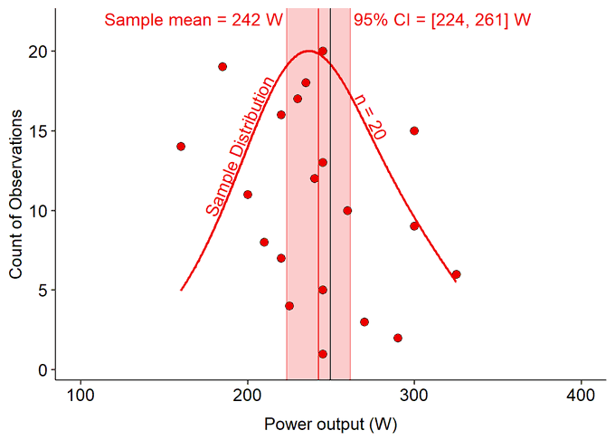
The number of observations is also important to estimating the CI around the estimated mean. Because more observations gives us a better estimate of the true distribution of scores within the population.
A larger sample size should improve the estimate of the mean (the sample mean) toward the true population mean, as well as tighten the CI around that estimate. More observations – more data – helps to improve our confidence in our estimate of the true mean of the population.
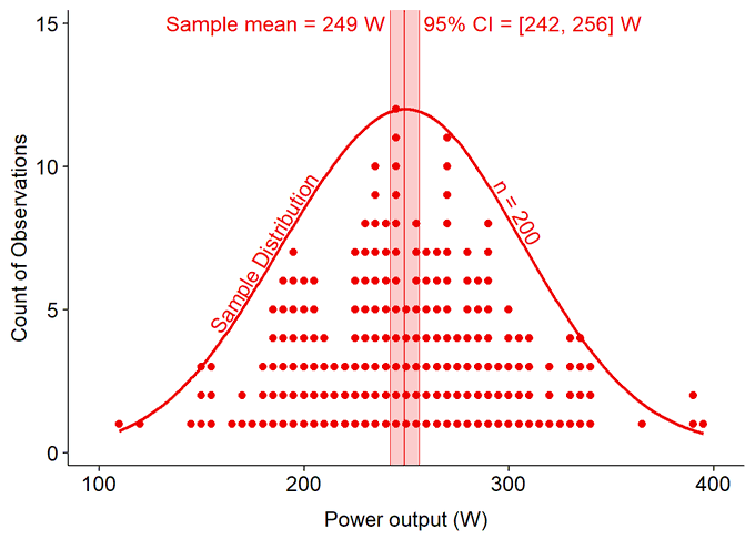
So it is generally simple to improve an estimate of a group-level (population-level) parameter. More data allows us to be more confident in our estimate and predictions.
But what about predicting any one individual observation from within that population?
Prediction Intervals
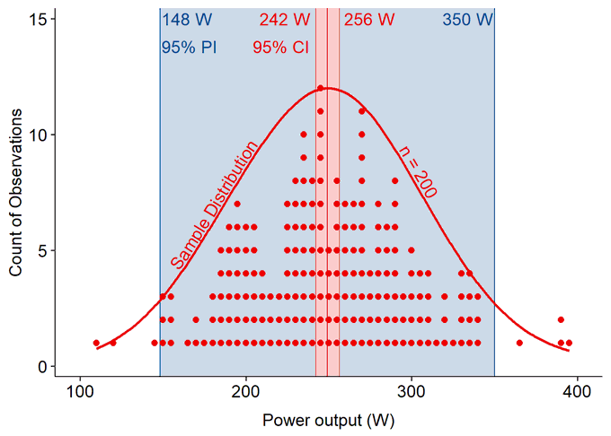
The prediction interval (PI) captures the uncertainty of predicting individual observations. Like CI, PI represent a range of uncertainty, but at an individual-level. It represents a range within which we can expect the next observation to fall, and that observation might fall anywhere within this range.
Probabilistically, if the population parameter is normally distributed (as in our simulated example), then we are more likely to observe values close to the mean, however we cannot know whether the next observation – the next athlete that walks into our lab to be tested – will be near the mean, or an outlier near the margins of the population.
What happens when we scale up our number of observations, like large population-level datasets that our gadgets are collecting?
More data narrows the confidence interval, i.e. improves our confident and reduces uncertainty for the true population mean value. With gigantic population-scale datasets, our gadgets can be extremely confident where the population mean falls, with narrow CI.
However, the prediction interval has remained wide in this simulated dataset. Why?

Prediction intervals are determined primarily by the magnitude of real variation within the population. So as we sample more observations, we get a better estimate of that real variation, but that variation is not reduced..
Different athletes really truly do have very different power outputs, and so our PI will always remain wide to reflect the uncertainty we will have for whether the next athlete we sample will have a higher or a lower power output.
Think of it as:
⚫ As the number of samples (n) approaches the population size (N),
🔴 Confidence Intervals converges on (→) the true mean value, i.e. CI are reduced to zero.
🔵Prediction Intervals converge on (→) the real variation within the population, i.e. 1.96 SDs or 95% of the variance in the population.
If we measured every individual in the population, then our ‘estimated’ mean score would exactly equal the true population mean score, and our range of uncertainty around that estimate would be zero; CI would converge to a range of zero around the mean.
But if we measured every individual except one, we still don’t know where that last individual observation will fall within the population distribution.
Interim TLDR
- More data improves the accuracy of group-level estimates, such as mean score
- More data reduces uncertainty and narrows confidence intervals around a group-level estimate
- More data does not improve individual estimates (as much), and does not reduce the uncertainty (the prediction interval) to predict the next individual-level observation.
- A sample of observations that do not represent a random distribution of scores from the population will result in inaccurate group-level and individual-level estimates.
Also keep in mind, this is true for univariate prediction relationships; a single predictor variable trying to predict a response outcome. Of course, this isn’t always the case and many gadgets have much better individual predictions by using multivariate prediction models. However, in principle, the same limitations exist whenever predicting individual responses from group level data.
In my opinion, we need to consider group- and individual-level uncertainty whenever we are interpreting research or individual athlete training data.
Real Data of Blood Lactate Curves
Here is a real-world example from a dataset where we collected blood lactate ([BLa]) samples. These data came from the same experiment from which we published test-retest reliability values in common cycling metrics.
Briefly, we collected capillary [BLa] from 21 trained female & male cyclists, at the end of each 5-minute work stage during a graded ‘5-1’ cycling assessment to maximal task tolerance.
The [BLa] scores were then plotted as a function of ‘relative intensity’, i.e. a percent scale of the highest workload attained by each athlete. We then fit these scores to cubic polynomials to generate the estimated lactate curve for each individual athlete.
What if we calculated the old-school lactate threshold at a fixed concentration of 4.0 mmol/L?

This really shows us the range of intensity on the x-axis that 4.0 mmol/L might occur for each individual athlete. Let’s take a look at the 95% CI and PI on the same plot.
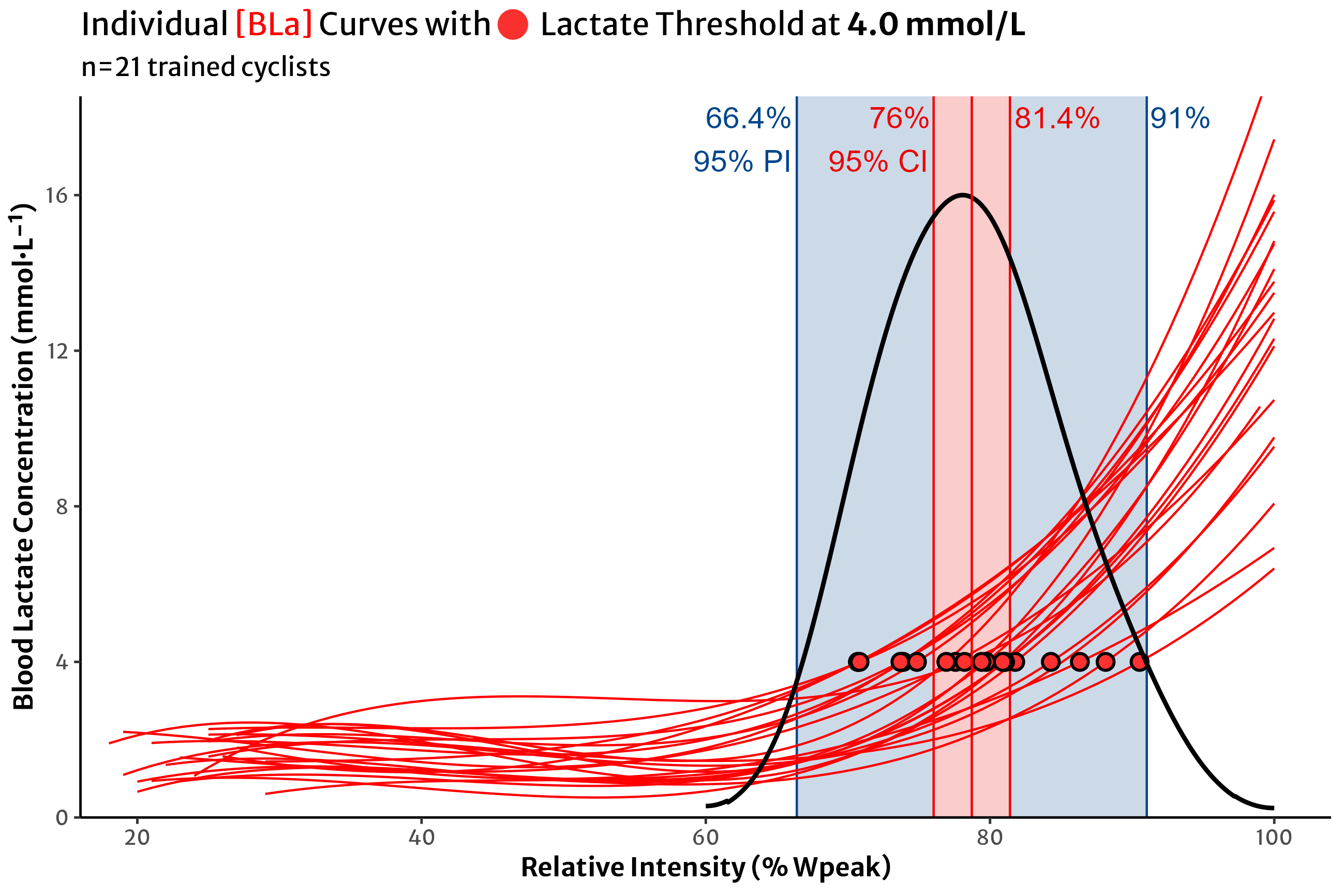
So if we want to use 4.0 mmol/L as our lactate threshold estimate in this dataset of trained cyclists, the group mean value occurs somewhere around 80% intensity, and with 21 participants, we have a relatively tight confidence interval around that estimate (78.7% [76.0, 81.4]).
But the range of individual values tells us that if we continued to test similar athletes, we could expect their LT estimates to occur anywhere from 65-90% of their individual intensity.
If I’m looking at these data and I want to estimate where my own LT is, how confident can I be that I will be one of the athletes near the group mean 80%? Or what are the chances I’m one of the athletes at either end of the prediction interval?
For many athletes, the mean estimate will be relatively close (assuming this parameter is normally distributed). However, unless I test it, I don’t know whether I’m one of those athletes near the centre, or near the edges.
Not to mention, this doesn’t tell us how valid this estimate of lactate threshold really is to predict my performance, which is one of the two goals of performance testing. But that’s a conversation for another time.
This goes for any prediction we want to make for an individual athlete, assuming no prior information, based on a group-level dataset. For athletes and coaches in this position, looking at the confidence interval of a group mean is much less informative than considering the the prediction interval and the spread of the entire group.
Between-Individual vs Within-Individual Uncertainty
Now hopefully we understand a bit more about the uncertainty we should expect for group-level and individual-level observations. These are used to estimate and predict values between individuals within a certain population.
What about quantifying uncertainty within a single individual across repeated measurements?
This is the difference between group-level research and individual-level application, i.e. coaching! Group-level research makes single observations from multiple individuals to estimate a population.
Individual-level coaching is about making multiple repeated observations over time from a single individual to predict future observations from that individual. This allows us to have more confidence in making decisions, prescribing training, predicting future observations, etc.
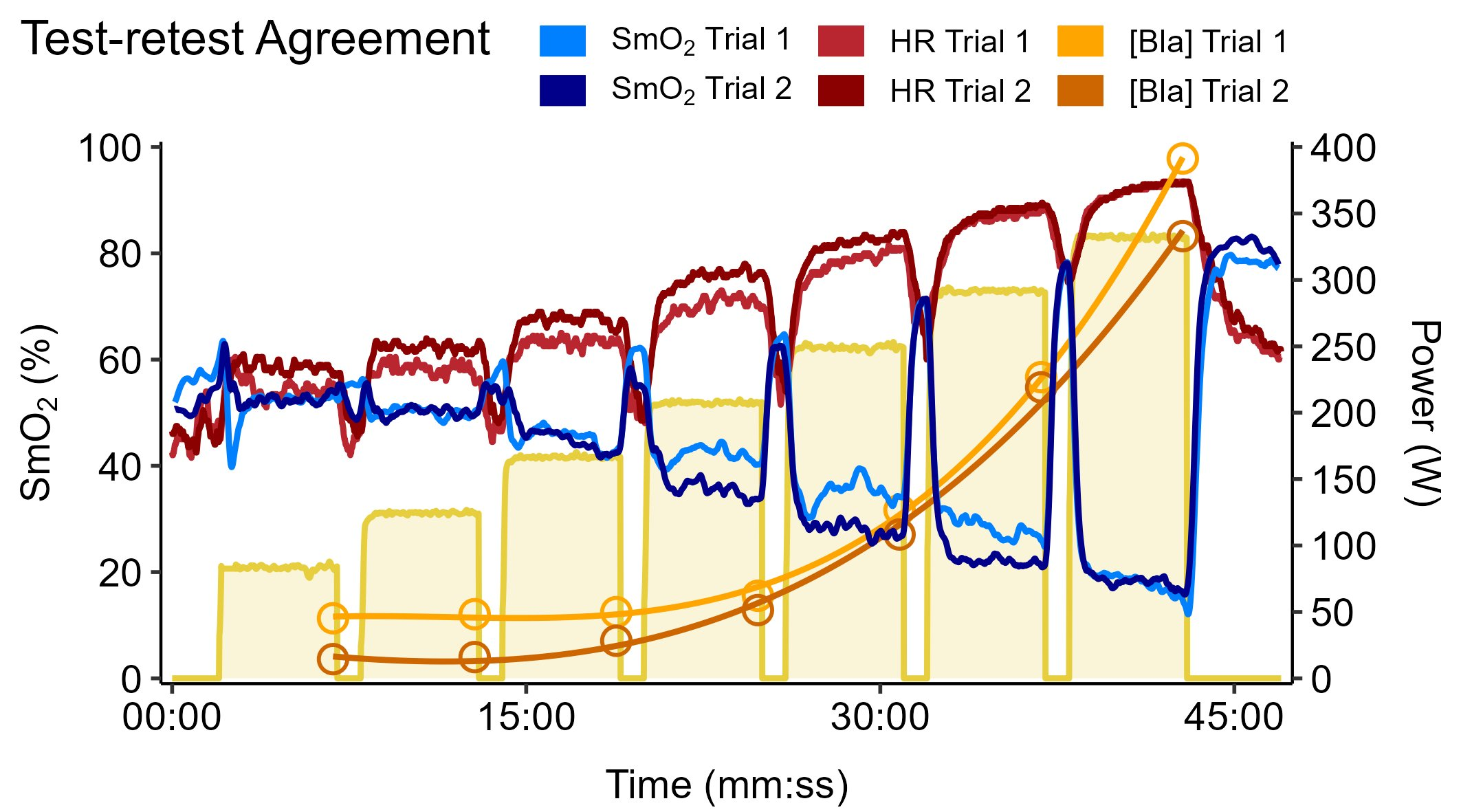
To quantify the within-individual variability we should expect for common cycling metrics between any given session, take a look at our recently published study where we compared heart rate, oxygen uptake (V̇O₂), NIRS muscle oxygenation (SmO₂), and the same [BLa] data I’ve presented here.
TLDR
- Every measurement has uncertainty
- Consider if we are trying to make group-level estimates from group-level data (confidence intervals), …
- Or individual-level predictions from group-level data (prediction intervals), …
- Or individual-level predictions from individual-level repeated measures (SEM & MDC).
- Understanding the sources and magnitude of uncertainty (our CIs & PIs!) can help us to be more confidence – not less confident – in how we are interpreting our data and applying that information for our athletes.
