WKO4 is a data analytics engine from TrainingPeaks. I’ve used it for the past season to dig into my numbers and optimize my training. I find it invaluable in revealing gaps in my fitness, and quantifying where I can improve and how I should target that improvement.
Here is some of the analysis I have done for my own 2017 Season Review.
Bear with me.. some of these charts get complicated (of course!).
PMC – Performance manager Chart
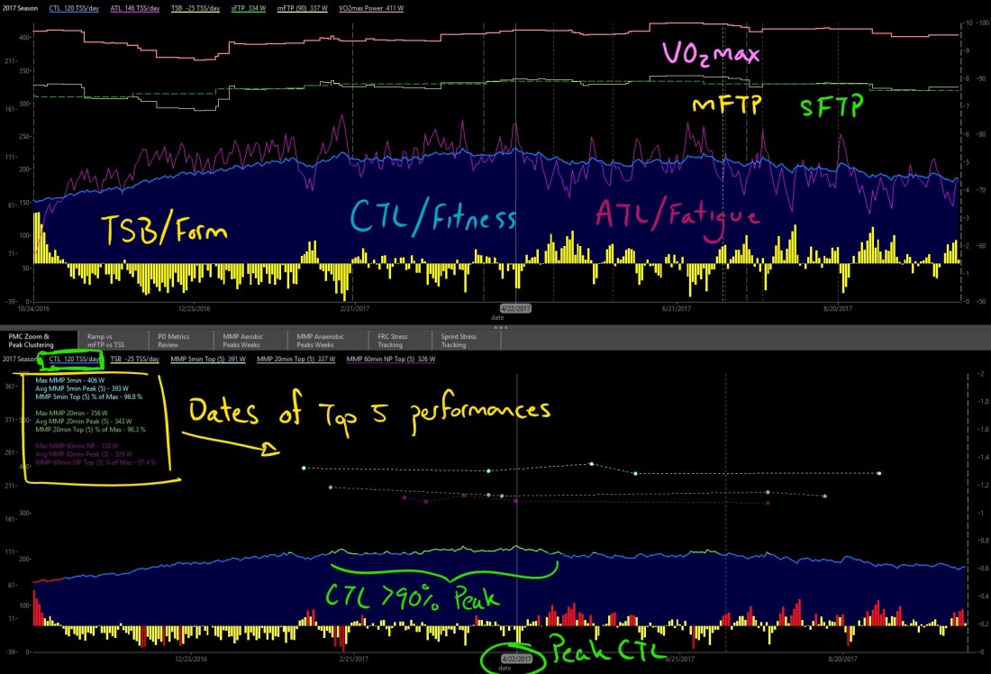
The PMC is analogous to Strava’s Fitness and Freshness Graph, and TrainingPeaks’ Performance Manager Chart. It shows my Fitness (CTL), Fatigue (ATL), and Form (TSB) over the entire 2017 Season. The top and bottom charts below show slightly different metrics based on the same PMC.
I refer to this and other related charts to show me general trends in training load and performance metrics.
PMC – Performance Manager Charts

- Top chart includes trendlines for modeled FTP (mFTP), user-set FTP (sFTP) and modeled VO2max.
- These metrics are determined by the actual performances I put in, so they are modeled estimates based on real peak performances over a rolling 90-day period.
- They show me at a glance where I was gaining fitness and where I was losing fitness.
- The bottom chart includes top-5 performances for 5min & 20min power, and 60min NP. Where these occur and how closely the top-5 numbers cluster (>95%) can tell me when I was hitting peak form.
- Both the CTL (blue line) and TSB (yellow bars) turn red in the bottom chart when I’m outside of my target band of training load: when I’m digging too deep and possibly accumulating too much fatigue, or when I’m over-rested and losing fitness.
- The cursor is highlighting the date of my peak CTL: 120 tss/day on April 22, 2017. This was timed to peak at the start of my race block through May-June.
Early Season
I started training in late October, 2016 and had a steady ramp in CTL through Base phase until February, 2017. My TSB only hit red (too much fatigue) a couple times and barely went positive for 3 months, indicating I was consistent and able to tolerate the accumulating training load.

mFTP & VO2max metrics appeared to decline through the first couple months, but this is an artefact of the model looking at the previous 90-days, so as end-of-2016 performances ‘fell off the back’ of the 90-day model, the metrics would appear to decline. But they quickly ramped back up as my training produced new peak numbers to fill out the model.
I can manually adjust many of the metrics to use whatever ‘lookback’ period I want, so often at the end of the season it can be more accurate to look at a 60-day, 42-day, or even 28-day model to account for declining fitness through the off-season.
Race Season
I hit my Season peak CTL in late April, before my major racing block in May-June, including Tour de Bloom and the BC Provincial Champs Road Race. I don’t want to race at my absolute peak CTL, since I would be carrying too much fatigue (high ATL). The idea is to peak a few weeks out from your target events, then taper by as much as 10% to drop fatigue and go into the races fresh.
However in retrospect, I probably dropped too much fitness, too far out from my first A-race: BC Provincial Champs RR. My mFTP & VO2max metrics dropped a bit in the weeks before the race, meaning I had probably lost more in fitness than I had gained in freshness.

After the first block of racing was done, I began to build back up for BC Superweek in mid-July. This is where the second smaller peak CTL was reached, and I timed it better to coincide with my next A-race: the Delta UCI 1.2 Road Race. My metrics were all near their absolute Season peak (mFTP @ 341 W, VO2max @ 421 W) and I was fit and fresh. It ended up being a great race for me alongside some of the best in North America.
Fondo Season
After BC Superweek, it was time to de-stress from Race Season and embrace the long, epic rides of late-summer ‘Fondo Season!’ Where I’m less concerned with numbers, and more interested in refreshing my enjoyment of riding a bike with friends & teammates. Often some of our longest & hardest rides are during this time of season, since we don’t have to worry about over-fatiguing for the next interval workout or an upcoming race.
My CTL slowly declined through Aug-Sept, with the occasional spike in fatigue from some massive ride or another. And indeed I continued to hit top-5 5min & 20min numbers late into the season. But instead of going hard and trying to maintain peak fitness, I was happy to let my form decline slowly, rather than end up burning out and having it drop all at once.
Now in early October (when this chart was pictured) my CTL has dropped, but it’s still above the 60% ‘red-line’ of my Season peak. It will continue to drop a bit, but I feel more confident that I’ll be able to start from a higher base next season, and again reach a sustainable peak for my target races next year.
Stay tuned.
Is the PMC chart you are using a standard chart in the library or have you customized it? thanks
LikeLike
Most of my charts are at least slightly customized, but still based on the default charts available. Some of them are created by the chart wizards on the WKO4 Facebook group
LikeLike