WKO4 is a data analytics engine from TrainingPeaks. I’ve used it for the past season to dig into my numbers and optimize my training. I find it invaluable in revealing gaps in my fitness, and quantifying where I can improve and how I should target that improvement.
Here is some of the analysis I have done for my own 2017 Season Review.
Bear with me.. some of these charts get complicated (of course!).
PDC – Power Duration Curve
The PD Curve is used to visualize peak power performances across all time durations, for all activities within a selected date range or training cycle, such as ‘2017 Season’, or ‘2017 Base’, etc.. The PDC charts both intensity (power) and duration (time) components to model your own particular fitness profile. Again Strava and TrainingPeaks have similar power profile charts.
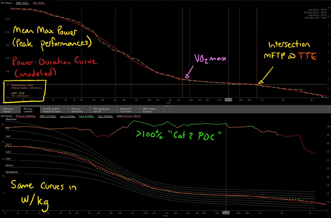
The top chart displays: mean maximal power (MMP); my actual peak performances over the entire 2017 Season.
Power Duration Curve (PDC); an algorithmic line-of-best-fit model that smooths out my MMP numbers.
The chart shows a bunch of other minor lines, but ignore these for now
The bottom chart shows the same MMP and PDC curves, in W/kg and normalized against a range of typical PD Curves (in white), according to competitive race category (Cats).
The red/orange/green line shows my MMP curve as a percentage of the Cat 2 PD Curve. Orange is within 10%, green is greater than 100% of the Cat 2 curve. This can show me where my relative strengths are, or what I need to work on.
I think of the Cat PD Curves as “the average PD Curve of the front of the peloton at any given time”. No one person will have the exact same curve as their Cat, but on average the strongest guys at the front of the race will be close to the PD Curve for that time duration.
Note: These Cat curves are very general, and shouldn’t be taken as an absolute indication of competitive level. They are necessarily very different between different local race scenes.
The PD Curve is like my individual fitness ‘fingerprint’. The shape of the PDC reflects what kind of a rider I am and what my particular strengths & weaknesses are.
From the excellent Aeroweenie blog
For example, sprinters tend to have sharp steep curves that peak at high power at shorter durations, and fall off more quickly to lower power over longer time durations.
Climbers or Time Trialists tend to have a flatter curve across all time durations, with less steep short durations and less of a drop at longer durations.
Interpreting my PD Curve
The cursor is highlighting 20min for both charts. Most of us use a 20min Test to estimate FTP, so this often creates an obvious ‘bump’ on the MMP line above PDC – ie. where your real peak performance outperforms your modeled PD Curve.
You can see I show this signature 20min bump, before my power drops past 20min out to around 50min. This is not the worst 20min bump I’ve seen, since I made sure to test at 40-60min through the season to get a more precise model of my fitness at these longer Aerobic time durations.
A few other bumps and dips can be seen between the MMP and PDC curves, reflecting points of over- and under-performances, respectively. These points can indicate relative strengths and weaknesses, but can also indicate where you just haven’t put in a true max effort to ‘fill out’ the PD Curve.
The modeled PD Curve is only as accurate as the data available, therefore if you haven’t put in a proper peak performance, the PDC won’t be able to accurately model your fitness around that time duration. And these bumps & dips can affect the other modeled metrics, such as mFTP, TTE, and VO2max. This is why simply looking at mFTP @ TTE number often isn’t sufficient to reveal your full fitness ‘fingerprint’.
Comparing my PD Curve to the Competition
I like to see that my power is >100% of Cat 2 PDC, for time durations from ~1min through 20min, and with another little bump at ~50min. This shows that at worst, I shouldn’t be left behind by a ‘typical’ Cat 2 field in most races.
Of course, since our races are nearly always combined Cat 1/2… this isn’t quite so easy! Really I should be benchmarking myself against the Cat 1 PDC if I’m looking to win races next year.
not quite so much green…
The Cat 1 PDC is certainly.. call it aspirational at this point!..
I don’t typically frame my goal setting around what my competition can do, but at least the Cat 1 PDC provides a general sense of where I need to be to give myself the best chance of success next season.
The PDC comparison here is based on the stock chart ‘PD Curve Cycling Profile’. I know the WKO4 folks don’t like to use the ‘Cat 1/2/3/etc’ categories for the normalized PD curves, and use ‘excellent/verygood/good/etc.’ instead. But I renamed them for my own use.
I have three expressions to create the percentage comparison line
In that order, then the first expression only shows green when PDC >100%, the second only shows orange when PDC >90%, and the third will show the whole curve red. Change the ‘pdcurve(“…”)’ expression from “excellent” to whichever normalized curve you want to compare against. See the stock chart for the names of each normalized curve.


Great work!
Did you write the code for the PD Curve with percentage comparison?
I would like to update mine with this feature: can you help me?
Thanks
LikeLike
The PDC comparison here is based on the stock chart ‘PD Curve Cycling Profile’. I know the WKO4 folks don’t like to use the ‘Cat 1/2/3/etc’ categories for the normalized PD curves, and use ‘excellent/verygood/good/etc.’ instead. But I renamed them for my own use.
I have three expressions to create the percentage comparison line
MMP >100% Cat 1:
@PDcomparison:=meanmax(bikepower/weight)/pdcurve(“excellent”),
if(@PDcomparison>1,@PDcomparison)
MMP >90% Cat 1:
@PDcomparison:=meanmax(bikepower/weight)/pdcurve(“excellent”),
if(@PDcomparison>0.9,@PDcomparison)
MMP % Cat 1:
@PDcomparison:=meanmax(bikepower/weight)/pdcurve(“excellent”)
In that order, then the first expression only shows green when PDC >100%, the second only shows orange when PDC >90%, and the third will show the whole curve red. Change the ‘pdcurve(“…”)’ expression from “excellent” to whichever normalized curve you want to compare against. See the stock chart for the names of each normalized curve.
Hope that helps!
LikeLike